What textures pair most effectively with Forevermark Midtown Grey cabinetry?
When you choose a neutral, sophisticated cabinet color like Forevermark Midtown Grey, the real magic comes from the textures you layer around it. Texture defines how a room feels — warm and lived-in, crisp and modern, or tactile and layered — and the right combinations can elevate Midtown Grey from a background tone to the anchor of a stunning design. Below are practical, style-forward topics and suggestions to help you pair textures that bring out the best in this versatile grey.
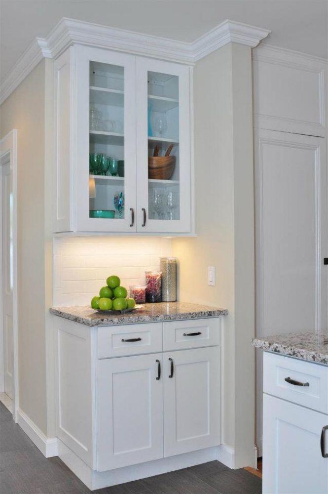
Natural wood and warm grains
Wood is the go-to texture for adding warmth and human scale to grey cabinetry. Light oak or honey-toned wood floors and open shelving introduce organic grain that softens Midtown Grey’s coolness. For a more contemporary look, choose wide-plank, low-gloss finishes to maintain a clean silhouette. On the flip side, darker walnut or smoked ash creates dramatic contrast and gives a more refined, moody aesthetic — especially effective in kitchens where cabinets sit against lighter walls or stone.
Tips:
-
Pair Midtown Grey base cabinets with a warm wood island to create a focal point.
-
Use the same wood species in smaller accents (cutting boards, floating shelves) to create continuity.
Honed and veined stone: countertops and accent slabs
Honed or lightly textured stone — think honed quartzite, marble with subtle veining, or a matte quartz — pairs beautifully with Midtown Grey. The stone’s tactile surface and natural patterning add visual interest without clashing. If you prefer a monochrome look, select stone with soft grey veins that echo the cabinetry. For bolder contrast, a cream or beige marble lifts the palette and brightens the space.
Practical considerations:
-
Honed surfaces hide water spots better than high-polish alternatives.
-
Consider slightly textured edges (chamfered or eased) to complement the cabinet profile.
Brushed and matte metals: hardware and fixtures
Metal finishes are small textured details that dramatically shift perception. Brushed nickel, satin brass, and matte black hardware each create distinct moods:
-
Brushed nickel reads modern and restrained with Midtown Grey.
-
Satin brass introduces warmth and a touch of luxury; it pops against grey without feeling flashy.
-
Matte black provides strong graphic contrast for an industrial or minimalist aesthetic.
Mixing metals is fine — use one finish for large fixtures (faucet, hood) and another for pulls and lighting to create layered depth.
Soft textiles: upholstery, rugs, and window treatments
Textiles soften hard surfaces and add scale. Linen napery, woven wool rugs, and boucle upholstery bring tactile richness that plays well with Midtown Grey’s even tone. For seating (bar stools or dining chairs), textured fabrics in warm creams, soft taupes, or muted blues keep the look cozy. Layered rugs — a natural fiber runner under a woven area rug — add an artisanal feel in open-plan spaces.
Design tips:
-
Choose textiles with visible weave to create contrast with the smoother cabinet finish.
-
Consider removable cushion covers for easy laundering; textured fabrics sometimes trap dust faster.
Terrazzo, ceramic, and patterned tile backsplashes
A textured backsplash is one of the most effective ways to introduce pattern without overwhelming. Terrazzo with flecks of warm colors can echo wood tones and metal accents; hand-glazed ceramic tiles add subtle sheen and irregularity that make a kitchen feel crafted. Subway tile with a lightly troweled grout line provides understated texture and classic charm.
How to decide:
-
Use larger-format tiles for a modern, seamless look; small mosaics for artisanal character.
-
Keep grout color intentional: slightly darker grout emphasizes the tile pattern; matching grout reduces visual busyness.
Concrete, plaster, and matte finishes
Matte plaster or polished concrete floors create a contemporary industrial backdrop that contrasts nicely with Midtown Grey cabinetry’s refined appearance. Concrete offers a tactile coolness and is very durable; plaster walls (lime or Venetian) have a soft, variegated surface that photographs beautifully and adds an old-world artisan feel.
Maintenance note:
-
Concrete requires sealing; choose finishes designed for residential interiors to avoid porosity issues.
Glass and reflective surfaces
Glass introduces lightness and depth. Frosted or seeded glass cabinet inserts reduce visual weight while preserving texture, and mirrored or polished metal backsplashes can reflect light into darker kitchens. If you want to preserve Midtown Grey’s matte personality, prefer satin glass or subtly textured mirrored panels rather than high-polish chrome everywhere.
Application ideas:
-
Use glass-front uppers with internal lighting to highlight textured dishware.
-
A small mirrored niche behind the stove can visually expand the work area.
Leather, cork, and unexpected tactile accents
Small leather details — a leather-wrapped kitchen stool or cabinet pull — introduce a luxe, unexpectedly tactile note next to Midtown Grey. Cork bulletin boards, leather placemats, or woven seagrass baskets add layers of texture and are especially effective in kitchens that double as casual family hubs.
Sustainability bonus:
-
Cork and seagrass are renewable and bring an eco-friendly texture to the space.
Lighting as texture: shadows and materiality
Texture isn’t only physical — it’s also how surfaces react to light. Matte finishes on cabinets absorb light and make texture feel soft; glossy surfaces reflect light and heighten contrast. Pendant lights with woven shades cast patterned shadows that add a layer of visual texture to the room, while ribbed glass pendants provide refracted highlights.
Practical tips:
-
Combine task lighting with ambient and accent to reveal texture intentionally.
-
Dimmable lighting lets you shift the room’s tactile perception from crisp daytime to soft evening.
Mixing textures for balance and depth
Successful interiors rarely rely on a single texture. The trick is to balance:
-
1 dominant texture (cabinet finish + countertop),
-
1 contrasting texture (wood or stone),
-
1 softening texture (textiles), and
-
a few small, tactile accents (metals, ceramics, leather).
Example palette:
-
Midtown Grey cabinets (dominant matte finish)
-
Warm oak island and open shelving (contrasting organic grain)
-
Honed quartz countertop (solid, subtle veining)
-
Woven linen runner and boucle stools (softening)
-
Satin brass faucet and matte black pulls (accents)
Practical maintenance and durability considerations
When mixing textures, consider how each material performs in a kitchen environment. Matte cabinet panels may show grease differently than gloss panels; porous stone demands sealing; woven textiles near prep areas require practical placement to avoid spills. Always factor in durability alongside aesthetics:
-
Choose sealed stones or engineered quartz for lower maintenance.
-
Use performance fabrics (stain-resistant blends) on seating.
-
Opt for hardware finishes that disguise fingerprints if you have an active household.
Why Choose Us?
At My Kitchen Cabinets, we understand that color is only the starting point — texture is where personality happens. We help clients pair finishes and materials so their cabinetry becomes the heart of a thoughtful, functional, and beautiful space. Our design guidance considers:
-
Practical durability for real life (kids, pets, heavy cooking),
-
Cohesive material pairings that photograph and live well,
-
Local sourcing options and recommendations for finish maintenance,
-
Custom hardware and millwork solutions to match your desired texture palette.
Whether you’re aiming for a warm Scandinavian kitchen, a moody urban loft, or a timeless transitional home, we provide expert recommendations to make Forevermark Midtown Grey feel intentional and complete.
Conclusion
Textures are the secret ingredient that define how a color reads in a room. Paired thoughtfully, natural woods, honed stone, matte metals, and tactile textiles will make Forevermark Midtown Grey feel dynamic, warm, and carefully crafted. The right mix brings balance: warmth where it’s needed, polish where it elevates, and softness where everyday life happens. Begin by selecting one dominant texture, add a contrasting surface, and finish with soft textiles and metal accents — and you’ll find Midtown Grey transitioning from a neutral to the soul of your space.
Frequently Asked Questions
Q: What textures pair most effectively with Forevermark Midtown Grey cabinetry?
A: Natural woods (light oak or warm walnut), honed stone or quartz with soft veining, brushed or satin metals (satin brass, brushed nickel), textured tiles (terrazzo or hand-glazed ceramic), and soft textiles (linen, wool, boucle) create complementary contrasts and depth. Balance warm and cool textures to avoid a flat grey result.
Q: Should I choose matte or glossy surfaces with Midtown Grey cabinets?
A: Matte surfaces harmonize with Midtown Grey’s understated elegance and create a calm, tactile feel. Glossy surfaces introduce more contrast and reflect light — useful in small kitchens to bounce light. For longevity and subtlety, many designers favor matte cabinet finishes paired with selectively glossy accents (backsplash, small appliances).
Q: Which countertop textures are best with Midtown Grey?
A: Honed or matte quartz and natural stones with gentle veining work exceptionally well. Lighter stones with warm veining create contrast, while greyscale stones produce a cohesive, monochromatic look. Engineered quartz offers consistent patterning and easier maintenance if you want the stone texture without the upkeep.
Q: Can I mix metal finishes with Midtown Grey cabinetry?
A: Yes — mixing finishes like satin brass for the faucet and matte black for pulls creates visual layering. Keep the number of distinct metal finishes to two or three and distribute them intentionally (large fixtures vs. small hardware) to maintain cohesion.
Q: How do I introduce texture in a small kitchen without making it feel cluttered?
A: Use subtle, low-profile textures: a single warm wood accent (island or shelf), a honed countertop, a soft runner, and one patterned backsplash. Keep the palette limited and use lighting to highlight textural differences rather than adding additional pattern.