What paint colors work best with Forevermark Gramercy White cabinetry?
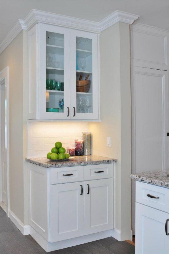
Forevermark Gramercy White cabinetry is known for its clean, crisp white finish and classic shaker style that provides a versatile foundation for any kitchen or living space. Selecting the right paint colors to complement this cabinetry can elevate the room’s overall aesthetic, creating a harmonious and inviting environment. Choosing paint colors that pair well with Gramercy White cabinets involves understanding undertones, lighting, and the atmosphere you want to achieve. This article explores the best paint colors to match Forevermark Gramercy White cabinetry, offering inspiration and practical guidance for homeowners and designers.
Understanding the Undertones of Gramercy White Cabinets
Before selecting paint colors, it’s important to recognize the undertones in the Gramercy White finish:
-
Gramercy White is a bright white with subtle warm undertones.
-
These undertones lean toward creamy or soft beige rather than stark or bluish white.
-
The finish is smooth and matte to satin, affecting how light interacts with it.
Knowing this helps in choosing complementary or contrasting paint colors that enhance the cabinetry without clashing.
Neutral Paint Colors That Pair Beautifully
Neutral walls create a timeless backdrop that enhances Gramercy White cabinets while maintaining a clean and spacious feel.
Soft Grays
-
Light and medium grays with warm undertones work well.
-
Shades like Benjamin Moore’s “Revere Pewter” or Sherwin-Williams’ “Agreeable Gray” offer a subtle contrast.
-
Grays add depth and sophistication without overpowering white cabinets.
Warm Beiges and Taupes
-
Colors such as “Accessible Beige” or “Balanced Beige” highlight the warm undertones in Gramercy White.
-
These tones create a cozy, welcoming ambiance.
-
They pair well with natural wood accents and warm metals.
Classic Whites and Off-Whites
-
Off-white paint close to Gramercy White creates a monochromatic, seamless look.
-
Ideal for small spaces to maximize light and openness.
-
Examples include “Simply White” or “Alabaster.”
Bold and Statement Paint Colors for Accent Walls
For those wanting a more dynamic look, consider bold paint colors that contrast with the white cabinetry.
Deep Navy Blue
-
Navy creates a dramatic, sophisticated contrast.
-
Pairs beautifully with brass or gold hardware on cabinets.
-
Works well on accent walls or islands.
Forest Green
-
Rich, deep green shades bring a natural, earthy vibe.
-
Complements white cabinets while adding warmth.
-
Ideal for kitchens with wood flooring or natural stone countertops.
Charcoal and Black
-
Dark charcoal or black walls create high contrast and modern appeal.
-
Works best in larger spaces or with ample natural light.
-
Enhances the clean lines of shaker cabinetry.
Soft Pastels and Muted Colors for Subtle Style
Pastel and muted colors add personality without overwhelming the space.
Pale Blue and Sky Blue
-
Light blues evoke calmness and airiness.
-
Pair well with white cabinetry for a coastal or cottage look.
Sage and Mint Green
-
Soft greens offer a fresh, organic feel.
-
Works well in kitchens emphasizing natural materials.
Blush Pink and Soft Peach
-
Warm pinks add a touch of softness and elegance.
-
Coordinate with gold or rose gold hardware for a chic aesthetic.
Coordinating Trim and Ceiling Colors
Choosing trim and ceiling colors that complement Gramercy White cabinetry creates a polished, cohesive space.
-
Use crisp white or slightly warmer whites on trims to highlight architectural details.
-
Light gray or beige ceilings can soften the overall look.
-
Avoid colors that clash or blend too closely with cabinetry to maintain definition.
Tips for Selecting Paint Colors with Gramercy White Cabinets
Test Paint Samples in Your Space
-
Lighting conditions vary throughout the day, affecting color appearance.
-
Paint sample patches on different walls and observe them at various times.
Consider the Room’s Purpose and Mood
-
Choose calming neutrals for kitchens and bathrooms.
-
Bold colors work well in dining rooms or accent walls for personality.
Coordinate with Flooring and Countertops
-
Ensure paint color complements natural tones in flooring and countertops.
-
Avoid color clashes that disrupt the room’s flow.
Harmonize with Fixtures and Hardware
-
Match paint undertones to metals like brushed nickel, brass, or black hardware.
-
This creates a unified, intentional design.
Popular Paint Brands and Colors to Consider
| Brand | Paint Color | Description |
|---|---|---|
| Benjamin Moore | Revere Pewter (HC-172) | Warm gray, versatile neutral |
| Sherwin-Williams | Agreeable Gray (SW 7029) | Soft warm gray |
| Benjamin Moore | Simply White (OC-117) | Clean, warm white |
| Sherwin-Williams | Naval (SW 6244) | Deep navy blue |
| Benjamin Moore | Hale Navy (HC-154) | Classic, rich navy |
| Sherwin-Williams | Sea Salt (SW 6204) | Soft green-blue pastel |
| Benjamin Moore | Pale Oak (OC-20) | Light, warm beige |
Styling Tips to Enhance Paint and Cabinet Coordination
-
Add textured textiles and natural elements like wood or stone to soften contrasts.
-
Use complementary accessories such as rugs, curtains, and artwork.
-
Incorporate layered lighting to highlight colors and cabinet finish.
-
Balance bold wall colors with lighter furnishings and countertops.
Summary Table: Paint Color Categories for Gramercy White Cabinets
| Color Category | Examples | Effect on Space | Best For |
|---|---|---|---|
| Neutrals | Soft gray, warm beige | Timeless, sophisticated | All rooms |
| Bold & Statement | Navy, forest green, black | Dramatic, modern | Accent walls, islands |
| Pastels & Muted | Pale blue, sage, blush | Soft, calming, fresh | Coastal, cottage, casual |
| Whites & Off-Whites | Simply White, Alabaster | Clean, seamless | Small spaces, minimalist look |
Conclusion
Forevermark Gramercy White cabinets provide a timeless, versatile backdrop that pairs beautifully with a range of paint colors—from soft neutrals to bold statement hues. Understanding the cabinetry’s warm undertones is key to creating a harmonious palette that enhances both style and function. Whether you choose calming grays, cozy beiges, crisp whites, dramatic blues, or fresh pastels, the right wall color can transform your space into a cohesive and inviting environment. By testing samples, considering lighting, and coordinating with hardware, flooring, and countertops, homeowners can achieve a balanced, designer-quality look that complements the clean elegance of Gramercy White cabinetry.
Frequently Asked Questions
Q: What undertones should I consider when choosing paint colors for Gramercy White cabinets?
A: Gramercy White has subtle warm undertones, leaning toward creamy or soft beige, so colors with similar warmth tend to pair best.
Q: Which neutral paint colors work best with Gramercy White cabinets?
A: Warm grays like “Revere Pewter” or “Agreeable Gray” and soft beiges like “Accessible Beige” complement the cabinetry beautifully.
Q: Can I use bold colors with Gramercy White cabinets?
A: Yes. Deep navy, forest green, or charcoal can create dramatic contrast, especially on accent walls or kitchen islands.
Q: What are good pastel options for a softer look?
A: Light blues, sage greens, and blush pinks add personality while keeping the space fresh and inviting.
Q: Should trim and ceiling colors match the cabinets?
A: Trim can match or be slightly warmer than Gramercy White, while ceilings may be light neutral tones to soften the look.