What role does Forevermark Midtown Grey play in achieving balance between light and dark décor?
In kitchen design, striking the perfect equilibrium between bright, airy elements and deeper, moodier accents can transform a space from merely functional into a true centerpiece of the home. One of the most versatile tools in a designer’s palette is cabinet finish—and among these, the subtle sophistication of Forevermark Midtown Grey offers a harmonious midpoint between the extremes of light and dark décor. Its neutral yet character-rich hue provides both a backdrop for lighter materials and a foil for darker accents, ensuring that neither overwhelms the other. By exploring how this shade functions in various contexts—paired with contrasting countertops, backsplashes, lighting schemes, and décor elements—homeowners and designers alike can orchestrate a cohesive, balanced environment that feels both dynamic and serene.
Understanding Color Dynamics in Kitchen Design
Color theory teaches us that every shade carries emotional weight and can influence the perception of space. Light tones—whites, creams, pale woods—tend to make areas feel larger and more open, while darker hues—charcoal, navy, espresso—add depth and intimacy. When designers introduce a midtone like Midtown Grey, they anchor the palette, preventing light elements from appearing washed out and dark accents from overpowering the room. The result is a visually pleasing gradient that flows naturally from one shade to another, guiding the eye and fostering a sense of unity.
The Unique Characteristics of Midtown Grey
Midtown Grey stands out for its balanced undertones: it’s neither too cool nor too warm. This neutrality means it adapts to varying light conditions—morning sunlight, midday brightness, and evening glow—without shifting drastically in appearance. Its fine-grain finish reflects just enough light to feel lively, yet retains enough depth to avoid looking flat. In cabinetry, this translates to a finish that feels substantial and refined, capable of complementing both crisp white marble countertops and richer, darker woods.
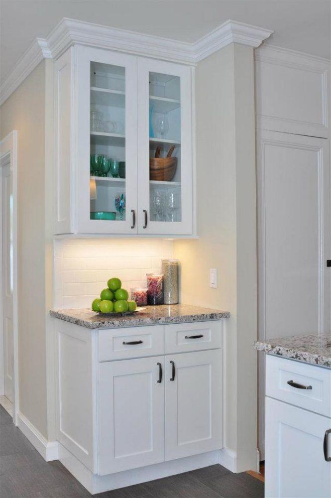
Pairing Midtown Grey with Light Décor Elements
When integrated alongside light cabinetry or wall treatments, Midtown Grey provides contrast without jarring difference. For example:
-
White Quartz Countertops: The cool sparkle of white quartz set against Midtown Grey cabinets creates a classic, timeless combination. The grey provides just enough relief so the white remains vivid without looking sterile.
-
Pale Subway Tile Backsplash: A white or light-gray subway tile helps bounce light into the workspace. Midtown Grey cabinets frame this backsplash beautifully, reinforcing the backsplash’s brightness and adding silhouette definition.
-
Light Hardwood Floors: Oak or maple flooring in a light stain supports an open, airy feel. Against this foundation, Midtown Grey cabinetry maintains visual interest at eye level without closing in the room.
Balancing Dark Accents in Your Kitchen
Dark accents lend drama and sophistication, but can prove overwhelming if overused. Midtown Grey serves as a transition between bright and dark, allowing designers to introduce deeper elements selectively:
-
Black Hardware and Fixtures: Matte black knobs, pulls, and faucets stand out crisply against grey doors, offering a modern edge without the heaviness of a dark cabinet.
-
Deep Countertop Veining: A surface with charcoal veining—such as honed granite—resonates with Midtown Grey, echoing its undertones while distinguishing the countertop as a focal point.
-
Accent Walls or Open Shelving: Painting a single wall in charcoal or installing black-metal open shelving becomes more approachable when adjacent cabinetry is Midtown Grey, softening the impact of darker hues.
Material Finishes and Textural Contrast
Balance in décor extends beyond color; texture and finish also play pivotal roles. The semi-matte sheen of Midtown Grey cabinetry can be contrasted with:
-
Polished Marble or Granite: Glossy stone surfaces reflect light, drawing attention to their unique patterning against the smoother cabinet finish.
-
Brushed Metal Accents: Stainless steel or brass fixtures introduce warm or cool metallic highlights, enlivening the grey surfaces and adding tactile interest.
-
Wood Grain and Open Shelves: Incorporating natural wood shelving or furniture pieces brings organic warmth, offering a tactile counterpoint to the painted cabinet finish.
Optimizing Lighting to Enhance Balance
Lighting design amplifies the interplay between light and dark elements. Thoughtful layering of illumination ensures Midtown Grey performs at its best:
-
Ambient Lighting: Overhead fixtures—recessed lights or a statement chandelier—establish overall brightness, ensuring grey cabinetry reads true to tone.
-
Task Lighting: Under-cabinet LEDs brighten work surfaces, preventing shadowed zones that might otherwise dull the grey finish.
-
Accent Lighting: Inside-cabinet lighting or toe-kick LEDs create soft glows that dramatize cabinet profiles and highlight the subtlety of Midtown Grey.
Incorporating Midtown Grey in Various Design Styles
The neutrality and versatility of Midtown Grey make it suitable for multiple design aesthetics:
-
Modern Minimalist: Clean lines, handleless cabinets, and monochromatic accents come alive when balanced by the gentle presence of Midtown Grey, offsetting stark whites.
-
Transitional: Combining classic and contemporary elements, this style relies on a median hue like Midtown Grey to tie together antique-inspired hardware and modern fixtures.
-
Scandinavian: Crisp, functional spaces with light woods and simple textiles benefit from the grounding effect of Midtown Grey, which adds depth without negating brightness.
-
Industrial: Exposed brick, black metal, and concrete surfaces feel more cohesive when balanced by midtone cabinetry, which smooths the transition between raw materials and refined finishes.
Maintenance and Durability Considerations
Beyond aesthetics, practical concerns influence cabinet selection. Midtown Grey finishes are often engineered to resist scuffs, fingerprints, and UV fading. Regular cleaning with mild soap and water preserves the finish, while periodic application of a protective wax or oil (depending on manufacturer recommendations) strengthens resistance to wear. Its neutral hue also conceals minor marks better than pure white or very dark cabinets, reducing the appearance of daily wear.
Why Choose Us?
At My Kitchen Cabinets, we understand that the heart of your home deserves products that marry form and function. Our commitment to craftsmanship and quality ensures:
-
Expert Color Matching: We meticulously calibrate our finishes to maintain consistent Midtown Grey across all cabinet components, guaranteeing a seamless look.
-
Premium Materials: From durable, moisture-resistant MDF to sustainably sourced hardwoods, each cabinet is built to endure the rigors of daily use.
-
Customization Options: Choose from a spectrum of complementary hardware and hardware finishes to fine-tune the balance between light and dark in your custom design.
-
Professional Support: Our design consultants guide you through every step—from selecting finishes to coordinating lighting—so your kitchen achieves the perfect harmony of elements.
Conclusion
Achieving harmony between light and dark décor is an art form that hinges on thoughtful selection of materials, finishes, and lighting. Forevermark Midtown Grey cabinetry serves as the ideal bridge, anchoring brighter accents and framing darker elements without bias. Its neutral undertones, adaptable finish, and resistance to daily wear make it a practical and aesthetic choice for diverse kitchen styles. By pairing Midtown Grey with the right countertops, backsplashes, hardware, and lighting, homeowners can create spaces that feel both expansive and intimate, modern yet timeless—a balanced environment where every element feels in dialogue.
Frequently Asked Questions
Q: What role does Forevermark Midtown Grey play in achieving balance between light and dark décor?
A: Forevermark Midtown Grey acts as a neutral midpoint, providing visual weight to light elements and softening the impact of darker accents. Its balanced undertones ensure color consistency under varied lighting, helping to unify contrasting materials into a cohesive design.
Q: How can I pair Midtown Grey cabinetry with lighter countertop materials?
A: Light countertops like white quartz or pale marble work beautifully against Midtown Grey. The subtle contrast highlights the veining or sparkle of the countertop while the grey frames and grounds the lighter surface, preventing an overly stark look.
Q: Will Midtown Grey show fingerprints and smudges easily?
A: The semi-matte finish of Midtown Grey is designed to minimize the appearance of fingerprints and smudges. Regular cleaning with a soft cloth and mild detergent keeps the surface looking fresh, and the neutral hue conceals minor marks better than high-gloss or very dark finishes.
Q: Can Midtown Grey cabinets complement dark hardware and fixtures?
A: Absolutely. Matte black or brushed metal hardware stands out crisply against Midtown Grey, offering striking contrast without overwhelming the overall palette. This combination creates a modern, tailored appearance.
Q: What lighting strategies enhance the balanced look of Midtown Grey cabinetry?
A: Combining ambient overhead lights, under-cabinet task lighting, and accent LEDs creates layered illumination that showcases the true tone of Midtown Grey. This approach ensures the cabinets neither appear too light in bright conditions nor too dark in shadowed areas.