Is Forevermark Petit Blue Expected To Trend In 2026 And Beyond?
The world of kitchen design is constantly evolving—and cabinet colors are no exception. Among the many finishes available, the soft blue-gray hue of the Forevermark Petit Blue collection has gained a following for its blend of serenity and style. But the key question for homeowners, designers, and renovators is: Will Petit Blue continue to be on-trend in 2026 and beyond?
In this article, we’ll explore the factors that contribute to a color’s staying power in interior design, how Petit Blue aligns with these factors, the surrounding design and lifestyle trends, and the potential for this shade to remain relevant—or even rise in popularity—in coming years.
What Makes a Cabinet Color Trend-worthy?
Before diving into Petit Blue specifically, it’s helpful to understand what drives a cabinet color to become and stay “on trend.” Several overlapping factors contribute:
-
Color psychology and lifestyle shifts: People increasingly seek calmer, more restful spaces. As lifestyle trends lean toward wellness, sustainability, and comfort, colors that reflect those values become popular.
-
Influence of paint and design companies: When major paint brands release a “Color of the Year,” that often filters into cabinetry, backsplashes, hardware, and more. For example, the announced hues for 2026 show interest in smoky blues and blue-greens.
-
Interior architecture trends: Open floor plans, multipurpose kitchens, flexible living spaces—these influence how colors are chosen. Cabinets need to coordinate not just with one room but with a connected home.
-
Material and finish innovations: As cabinet manufacturers adopt low-VOC finishes, non-toxic paints, and more sustainable materials, certain color finishes that work with those eco-credentials become more desirable.
-
Resale and longevity considerations: Many homeowners prefer colors that feel timeless rather than super-trendy. If a cabinet color can bridge present appeal and future relevance, it’s more likely to endure.
Given those dynamics, let’s examine how Petit Blue stacks up.
How Forevermark Petit Blue Aligns with Emerging Color Trends
A. Cool Blue Tones are Gaining Momentum
Blue in cabinetry is not new—but its application and tone are evolving. A recent article states that “blue is the ultimate cabinet color for 2026.” Yahoo Shopping+1 At the same time, major paint brands are choosing blue-green or smoky jade as their 2026 colors of the year. For instance, Behr selected “Hidden Gem,” a smoky blue-green, as its 2026 Color of the Year.
Because Petit Blue is a muted blue with gray undertones, it fits squarely in the category of “cool blue tones with subtlety,” which design experts champion for upcoming years.
B. Versatility Across Styles
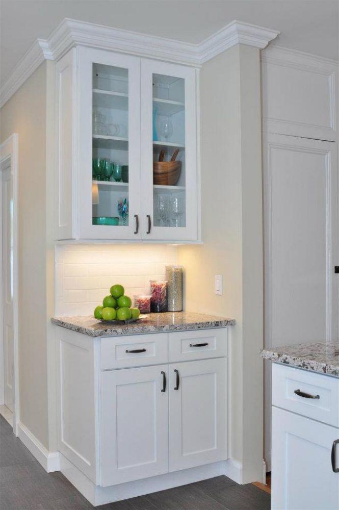
Petit Blue’s design description emphasises that it’s “soft, muted blue hue” with “tranquility and sophistication.” That means this tone can adapt to coastal, modern, transitional, or even farmhouse interiors. Versatility is a major plus for trend longevity—colors that only serve one aesthetic tend to fade faster.
C. Sustainability and Healthy Interior Trends
Designers are increasingly favoring finishes and materials with low‐VOC content, eco‐friendly manufacturing, and healthier indoor environments. Forevermark’s cabinet line is marketed with “CARB2 compliance” and other certifications. A color that sits on a cabinet line with sound environmental credentials is more likely to appeal to future-forward homeowners.
D. Balanced Between Statement and Timeless
One risk with bold cabinet colors is that they may age quickly. But Petit Blue seems positioned as a “quiet statement” rather than a loud trend color. Its softness reduces the risk of looking dated, while still offering more interest than plain white or beige. This balance enhances its potential staying power.
Possible Challenges to Petit Blue’s Trend Trajectory
While there are many favorable factors, it’s prudent to consider headwinds that might limit Petit Blue’s trend momentum.
-
Over-saturation risk: If many homeowners adopt pastel or muted blues, the market could become flooded, making the color less special or distinctive.
-
Lighting and environment sensitivity: Muted blue finishes can look different under various lighting conditions—artificial vs. natural, warm vs. cool light. A finish that appears perfect in one kitchen might look stale in another.
-
Shifting preferences toward warmer or more natural tones: Some trend forecasts indicate a move toward warmer, earthy neutrals and textures. For example, an article on kitchen colours to avoid in 2026 suggests navy and cooler blues may lose some appeal. If the broader trend shifts away from cool tones, Petit Blue might face headwinds.
-
Trend fatigue: Even versatile colors have lifecycle limits. If the market swings toward entirely different palettes (greens, terracottas, or mineral tones), blue-based finishes may eventually be seen as “older.”
Why 2026 Could Be a Pivotal Year for Petit Blue
Strategic Timing
With paint and interior trend authorities signaling muted blue-greens and smoky blue shades for 2026 (such as Behr’s “Hidden Gem”), a cabinet color like Petit Blue is well positioned to ride that wave. House Beautiful+1
Mid-Market Accessibility
While custom high-end cabinetry can chase the most avant-garde finishes, mid-market lines like Forevermark allow homeowners to adopt near-luxury finishes at more attainable prices. The affordability of Petit Blue may help adoption grow among a larger segment of homeowners.
Longevity Appeal
Homeowners increasingly invest in spaces meant to last long—thus colors that combine trend awareness with timelessness stand to benefit. If Petit Blue can be seen as both stylish now and still viable in 5–10 years, it has strong staying power.
Design Applications That Support Trend Longevity
Many of the reasons a color becomes long-lasting relate to how it is used in a design. Here are some applications that boost the staying power of Petit Blue:
-
Two-tone cabinetry: Using Petit Blue on lowers with white or wood uppers lets the color shine without dominating.
-
Accent islands: Applying Petit Blue just to the kitchen island offers trend appeal without committing the entire kitchen.
-
Mixing textures: Pairing the blue cabinetry with natural wood floors, brass hardware, or stone countertops adds warmth and complements the color’s versatility.
-
Open-concept coordination: Because many homes have the kitchen open to living spaces, a color like Petit Blue that coordinates across zones is advantageous.
-
Neutral pairings: Soft grays, creams, and muted metallics support the color without forcing it into a “statement” box, enhancing longevity.
Forecasting Beyond 2026: How Could Petit Blue Evolve?
Looking into mid‐to‐long term (2026–2030), we can speculate about scenarios for Petit Blue’s relevance:
Scenario A: Stabilization as a “Modern Neutral”
Petit Blue could transition into what designers call a “new neutral”—a color that acts as a foundational background rather than a bold accent. If this happens, it may become a safe choice for homeowners who still want color but not boldness. The blue-green tones flagged by paint brands support that possibility.
Scenario B: Refresh Cycle and Variant Wave
Every few years, colors shift slightly. Petit Blue may spawn variants—slightly more muted, more gray-blue, or warmer blue-leaning. Forevermark might release companion finishes (e.g., “Petit Blue Dust” or “Petit Blue Slate”) that keep the line fresh.
Scenario C: Fade in Favor of New Dominant Hues
Alternatively, if design trends move decisively toward warmer tones (olive, terracotta, oatmeal) or entirely different aesthetic directions (e.g., maximalist patterns), Petit Blue might still be serviceable but less “on-trend” than before. It could shift from fresh to familiar.
Why Forevermark Is Positioned to Support the Trend
The Forevermark brand itself offers advantages that support Petit Blue’s potential. According to product specifications, the Petit Blue line is CARB2-compliant, KCMA certified, and described as “visually appealing but durable” with a soft, muted blue hue. Products that combine design appeal with durable and sustainable materials often have greater staying power in the marketplace.
Moreover, the portrayal of Petit Blue in retailers emphasises its “tranquility,” “sophistication,” and “versatility.” That messaging aligns with long-term lifestyle values rather than short-term fads. Many consumers today want spaces that feel restful, connected to nature, and less frenetic. Petit Blue hits those marks.
Practical Tips for Homeowners Considering Petit Blue in 2026 and Beyond
If you’re thinking of choosing Forevermark Petit Blue cabinets and want them to feel future-proof, here are some tips:
-
Test how the color looks in your lighting: Because the tone is muted, it may appear differently in warm vs. cool lighting.
-
Pair with timeless surfaces: Choose countertop and backsplash materials that are classic (white quartz, light wood, soft stone) to help the blue stay relevant.
-
Use hardware that can easily update: If you ever want to refresh the look, swapping out pulls, handles, or fixtures can shift the feel without replacing cabinetry.
-
Consider mixing finishes: For example, use Petit Blue on base cabinets and a neutral on upper cabinets—this helps the blue endure.
-
Incorporate other colors subtly: If you love accent colors, keep them in interchangeable elements (pillows, rugs, chairs) rather than the cabinetry itself. That way, the core cabinet color remains stable.
Conclusion
After exploring the trends, design psychology, and market factors, the outlook for Forevermark Petit Blue in 2026 and beyond is quite favorable. Its alignment with emerging blue-green color shifts, its adaptable tone, and its positioning as a modern yet timeless finish give it strong potential to remain relevant. Of course, no color is immune to changing tastes, but Petit Blue’s balance of style, versatility, and sustainability suggests it’s more than a fleeting fad.
For homeowners looking to invest in cabinetry that feels both contemporary today and still appealing years from now, Petit Blue presents a compelling choice. It may well evolve into a “quiet classic” in kitchen design—one that blends color without overwhelming.
Frequently Asked Questions
Q1: Is Petit Blue more of a trend color or a timeless choice?
A: While it has trend-relevant qualities (such as its muted blue tone aligning with upcoming palettes), its soft neutrality and versatility make it more likely to transition into a timeless choice rather than being purely trendy.
Q2: How will lighting affect how Petit Blue looks over time?
A: Since it’s a muted blue with gray undertones, lighting variations (natural daylight, warm artificial light, cool LED) can significantly influence appearance. Testing samples in your space helps ensure the finish stays appealing as lighting technology evolves.
Q3: Can Petit Blue work in a resale home if I’m concerned about future buyers?
A: Yes. Its combination of stylish color and adaptability makes it likely to appeal to a broad range of buyers. Pairing it with neutral elements can further boost its resale friendliness.
Q4: Will more extreme color trends threaten Petit Blue’s relevance?
A: Possibly, but because Petit Blue is versatile and muted, it is less vulnerable than vivid accent colors. It may shift into more of a background role as accent colors change, but it shouldn’t feel outdated quickly.
Q5: Could Forevermark release updated versions of Petit Blue to keep pace with trends?
A: Yes—it’s common for brands to introduce companion finishes or variants (slightly cooler, warmer, or grayer) to refresh a line. If you choose the current Petit Blue, you may be able to supplement or adjust later to keep your space current without full renovation.