Have you explored the color variations available in Forevermark Townplace Crema?
Warm, welcoming, and quietly sophisticated—Forevermark Townplace Crema sits in that sweet spot where classic style meets modern comfort. But what really makes it shine is how versatile the color can be from room to room and even hour to hour. Under morning light it can read soft and airy; by evening it can feel cozy and grounded. If you’re planning a kitchen, bath, or whole-home refresh, understanding how this finish behaves with lighting, hardware, and surrounding materials will help you design a space that looks intentional and stays beautiful for years.
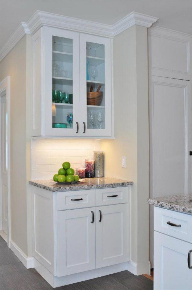
What “color variation” means for Townplace Crema
When people talk about color variation in Townplace Crema, they’re usually noticing three things working together:
-
Undertone shifts. The base is a creamy neutral. In warm light (west-facing windows, warm LED bulbs), it leans almond-beige; in cool light (north-facing windows, daylight LEDs), it can drift toward a gentle greige.
-
Edge definition and profile. Door styles with bevels, rails, or recessed panels create natural shadow lines that make the color look slightly deeper at the edges and lighter on wide, flat centers.
-
Context. Countertops, floors, wall paint, and even stainless or black appliances nudge the perceived color in warmer or cooler directions.
To get a feel for how it behaves, start with a sample door and walk it around your space at different times of day. Then hold it next to your flooring and countertop options. For a deeper dive into specs and styles, browse Forevermark Townplace Crema.
Undertones and lighting: how Crema shifts through the day
Lighting is the single biggest driver of how Townplace Crema reads. Use this quick guide as you plan:
| Lighting condition | Perceived tone | Design tips |
|---|---|---|
| Morning natural (east-facing) | Soft, fresh, slightly brighter | Pair with light oak or maple floors for a breezy feel. |
| Midday neutral | True creamy neutral | Great moment to judge wall paint; test both warm white and pale greige. |
| Evening warm (lamps, warm LEDs) | Cozier, more almond-beige | Add matte black or aged bronze hardware to keep balance. |
| Cool daylight LEDs | Hint of greige | Introduce warm textures—rattan, oak shelves, or brass pulls—to avoid looking chilly. |
Small changes—like shifting from 3000K to 2700K bulbs—can make a noticeable difference. If you want Townplace Crema to look warmer, choose bulbs in the 2700–3000K range and bring in natural wood accents.
Pairing strategies: countertops, backsplashes, and flooring
Because Townplace Crema is a versatile neutral, it plays nicely with a range of surfaces:
-
Countertops: Veined quartz in soft whites and light grays keeps the palette calm; warm marble-look quartz adds elegance; muted taupes or sand tones pull the cabinetry warmer.
-
Backsplashes: Handcrafted-look subway tiles (eggshell or bone) add texture; zellige adds shimmer; for contrast, consider charcoal or mid-gray grout in a simple pattern.
-
Flooring: Natural oak, hickory, or light walnut enhances warmth; pale porcelain planks brighten the overall space; medium-tone floors add grounding without feeling heavy.
If you’re designing a two-tone kitchen, Townplace Crema on the perimeter with a slightly deeper island (warm gray or mid-tone wood) creates a balanced focal point.
Accents that amplify Crema’s character
Details steer the mood:
-
Hardware: Brushed nickel leans contemporary; matte black makes a crisp, gallery-style statement; warm brass reads luxe and highlights the creamy undertone.
-
Open shelves & glass fronts: A few glass-front uppers lighten sightlines and make the color feel airier; wood open shelves introduce organic warmth.
-
Crown and light rail: Finished trim frames the cabinetry, creating soft shadow lines that add depth to the color without darkening the room.
-
Appliance panels: Panel-ready dishwashers or fridge panels extend the creamy canvas and minimize visual breaks.
Room-by-room applications
-
Kitchens: Townplace Crema is ideal for open-concept plans because it transitions smoothly into dining and living spaces. Add an island in a complementary color or wood tone for depth.
-
Bathrooms: The clean, creamy base pairs beautifully with stone-look tile and brushed metal fixtures; use satin or semi-gloss sheens where moisture resistance is important.
-
Laundry & mudrooms: Durable, easy-wipe fronts keep the space bright. Consider beadboard ends or shaker panels for casual charm.
-
Living spaces: Built-ins in Townplace Crema reduce visual noise around TVs and shelving, creating a calm backdrop for décor.
Texture and sheen: small tweaks, big visual impact
Even when the base color stays the same, surface qualities influence how you read it:
-
Matte or low-sheen finishes minimize glare and can look slightly deeper.
-
Satin is a versatile middle ground that feels soft yet practical.
-
Semi-gloss brightens and often looks a touch lighter, great for smaller or low-light rooms.
Door styles matter too. A simple shaker keeps lines modern; a slim-rail shaker feels transitional; raised details introduce classic character and increase light-and-shadow play.
Care, durability, and pet friendly living
Townplace Crema fits real life. For everyday messes, a damp microfiber cloth followed by a dry wipe is usually enough. Use mild, non-abrasive cleaners—harsh chemicals or scouring pads can dull any finish over time.
If your home is pet friendly, lean into practical details:
-
Toe-kick guards or matching quarter-round make fur clean-up easier.
-
Soft-close hinges and drawers reduce noise for anxious pets.
-
Install a washable runner or mat near food stations to protect base cabinets from splashes.
Keep a small touch-up kit on hand for life’s bumps, and place felt pads behind frequently used doors that contact walls.
Measuring, ordering, and color-matching best practices
-
Collect samples early. Evaluate door samples under your actual lighting, next to floors and counters.
-
Confirm paint and grout last. Choose wall paint and grout after you’ve finalized cabinets and counters to avoid undertone clashes.
-
Check lots and finishes. When possible, confirm your order comes from the same production batch for the most consistent look.
-
Plan your layout. Group large doors where they catch even light; consider glass or open shelves where natural light is limited.
-
Photograph in context. Take phone photos at morning, midday, and evening to spot shifts you might miss in person.
Why Choose Us?
At My Kitchen Cabinets, we focus on making your design decisions easier and your installation smoother. Here’s how we help you get Townplace Crema exactly right:
-
Curated guidance: We walk you through undertones, lighting choices, and pairings so your space reads warm and cohesive rather than mismatched.
-
Sample-first approach: We encourage in-home sample testing and can suggest complementary counters, backsplashes, and hardware to match your goals.
-
Layout & storage smarts: From island sizing to pantry inserts, our design suggestions keep everyday use in mind without sacrificing style.
-
Aftercare support: Simple care routines, touch-up guidance, and hardware adjustment tips help your cabinetry look new longer.
-
Transparent planning: We help map timelines, coordinate with your installer, and finalize details so there are fewer surprises on install day.
Our goal is simple: cabinets you’ll love in every light, every season, every day.
Conclusion
Forevermark Townplace Crema is more than a single swatch—it’s a flexible, high-confidence neutral that adapts to your lighting, surfaces, and style. Use warmer bulbs and wood accents if you want cozy; lean on veined quartz and matte black hardware for a crisper, gallery-style feel. Test samples where you’ll actually live with them, choose pairings that support (not fight) the undertone you prefer, and plan the layout so doors and trim cast flattering shadows. With the right combinations, Townplace Crema will deliver a timeless look that feels tailored to your home—and stays beautiful from busy mornings to quiet evenings.
Frequently Asked Questions
Q: Have you explored the color variations available in Forevermark Townplace Crema?
A: Yes. Expect a creamy neutral that shifts subtly with light and surroundings—warmer under soft, yellow-leaning bulbs and slightly greige under cooler daylight LEDs. Door profiles, trim, and nearby materials (floors, counters, backsplashes) also influence how the color reads.
Q: Will Townplace Crema look yellow in my kitchen?
A: In very warm lighting or next to strong honey-oak floors, it can lean warmer. Balance it with cooler elements (light veined quartz, matte black hardware) or choose wall paints with neutral undertones to keep the look fresh.
Q: What wall colors pair best with Townplace Crema?
A: Soft whites with balanced undertones, pale greiges, and muted mushroom tones are reliable. If you want a brighter space, keep walls lighter than the cabinets; for more contrast, use a mid-tone on surrounding walls or the island.
Q: Is Townplace Crema a good choice for small kitchens?
A: Absolutely. Its light, reflective quality opens up tight rooms. Consider semi-gloss or satin sheens, glass-front uppers, and under-cabinet lighting to amplify brightness.
Q: How do I keep a creamy cabinet from clashing with cool appliances?
A: Introduce a bridge element—veined quartz with both warm and cool notes, or hardware in brushed nickel—to connect the creamy tone to stainless or black finishes.
Q: What hardware finish looks best?
A: It depends on your goal. Matte black adds crisp contrast, brushed nickel feels understated and modern, and warm brass elevates the creamy undertone for a classic look.